
I’ve spent the last several days deep in ADA and WCAG 2.1 AA remediation work for a client site, and it’s changed how I think about accessibility — not as a legal checkbox, but as a real gap between what a site looks like and who can actually use it.
Here’s the thing nobody tells small business owners: “ADA compliance” sounds like a legal problem, but on WordPress it’s mostly a design and code problem, and it’s usually smaller than people fear.
Why I Bring This Up Unprompted
Demand letters and lawsuits over inaccessible websites aren’t just hitting big companies anymore. Restaurants, local shops, service businesses — sites that are easy to flag as non-compliant get targeted just as often, sometimes more.
But honestly, the legal risk is the smaller reason to care. When a site works properly with a screen reader or keyboard navigation, it’s usually just a better site — cleaner structure, better contrast, forms that actually make sense. I’ve watched this play out directly: fixing accessibility issues on a client site kept surfacing improvements that had nothing to do with compliance and everything to do with usability.
The Same Issues, Over and Over
Every WordPress site I’ve worked on hits some version of the same list:
- Alt text missing on images, especially ones dropped in through page builders instead of the media library
- Contrast that fails WCAG ratios even though it looks fine to a sighted eye
- Keyboard traps in menus, sliders, and popups from third-party plugins
- Form fields with no real coded label — just a placeholder that looks like one
- Skip links that are duplicated, broken, or missing
- PDFs that were never tagged, so a screen reader can’t read them at all
None of these are exotic. They’re just easy to miss unless you’re specifically looking, and the fix isn’t always where you’d guess — alt text lives in different places depending on whether an image came in through the media library or got hardcoded into block markup.
What “Compliant” Actually Means
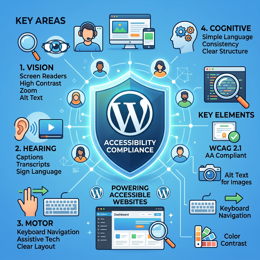
WCAG 2.1 AA is the standard most legal guidance points to. Four principles: perceivable, operable, understandable, robust. In practice: alt text, contrast, keyboard access, form labels, heading structure, real link text.
It’s a range, not a switch. I usually think of it in letter grades while I’m working through a site — some things (contrast, alt text, labels) get fixed fast, others (a broken nav pattern, a stack of untagged PDFs) take longer.
Where I’d Start, If This Is You
- Run an automated scan first (WAVE or axe catch the obvious stuff)
- Try navigating your own site with just a keyboard
- Check contrast on your actual brand colors, not theme defaults
- Look at alt text coverage across your media library and page builder content
- If you have PDFs posted, test one with a screen reader
You don’t need a full rebuild for any of this. Most of the work is targeted — page by page — and it can move a site from a failing grade to a strong B+/A- without touching the design.